5 Worst Corporate Logo Changes of 2016
A company’s logo is its most significant visual element. Over time, it becomes synonymous with the brand itself. When large companies make a change on this front, it’s generally well-executed and thoroughly contemplated. With 2017 well underway, let’s take a look at 5 company rebrands that missed the mark in 2016:
Taco Bell
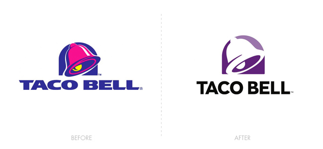
Hold the sauce… In a sad attempt to appeal to the minimalistic millennial, Taco Bell’s logo redesign took a fittingly vibrant logo with character and stripped it of its essence. A lackluster and unappetizing purple bell and generic typeface remained. The magenta, purple and yellow color palette and bold typography of the previous logo suited the brand well. The new logo is as bland as some people find their food to be.
Uber
Hail a design agency… The logo evolution of the ridesharing app, Uber, was widely criticized, and for good reason. Designed in-house with major input from the CEO (who has no design background), Uber’s rebrand is poorly executed and confusing. While the typeface is an enhancement on boldness alone, the old “U” brandmark was recognizable and coherent. The new mark is inspired by atoms and bits, supposedly referring to the building blocks of the company and overall technology within the world… Yeah…
Pandora
Heard this one before… When music streaming service Pandora revamped their logo in late 2016, it just felt like a song you’ve heard one too many times. There’s nothing inherently wrong with the logo itself. In fact, the wordmark has some redeeming qualities. However, the “P” brandmark reminds me of Paypal’s recent rebranding and, overall, lacks the excitement and individuality that one would expect from a brand in this industry.
tronc
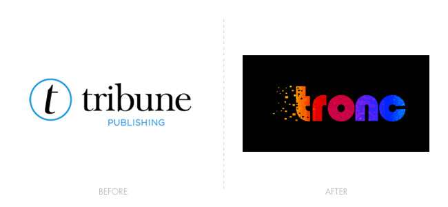
Old guy at the party… “Born” in 1847, Tribune Publishing Company announced it would rebrand itself “Tronc” which is short for “Tribune Online Content” and, if that weren’t misguided enough, offered up this abomination of a logo. A typeface out of the 80’s, an orange-to-blue rainbow gradient, a circuit-board texture and a digitizing “t” complete with trailing bits. I’m offended on behalf of typography.
CFL
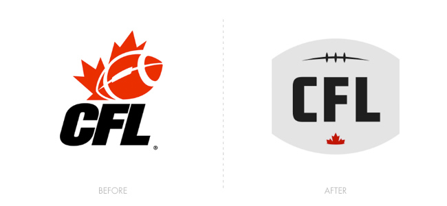
Cropped Football League… Or Canadian Football League, rather, unveiled a new logo in 2016. While the old logo (in use since 2003) warranted an upgrade, the resulting mark looks more like a tombstone than a sports league. A grey football with the ends cropped off loses most on its execution. While this minimalist approach was on its way to being successful, the coloring, sizing and spacing of elements just seem off.
Written by: Jonathan Graf, Art & Web Director at Immotion Studios
